Quick Tip: Viewing multiple matches from a Full Library Search

If you are doing exhaustive research, one of the tools you might use in SwordSearcher is the Full Library Search (found on the search menu). This lets you find words in your entire library, including books and commentaries, with just a few clicks. Here I am going to show you a very small change in SwordSearcher 8.1 that makes it easier to review search results:

After a Full Library Search, you are presented with a list of entries in your library that contain what you are looking for, along with a preview of the first match in the entry, like this:

Full Library Search results showing that Genesis 1:1 in the Ellicott commentary contains the word "condemned."
Full Library Search results showing that Genesis 1:1 in the Ellicott commentary contains the word “condemned.”

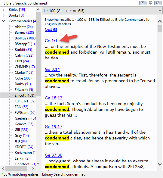
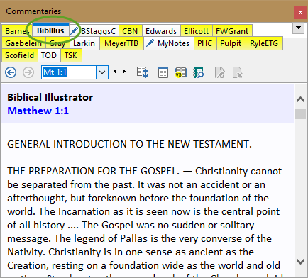
As you can see, there is a match in Genesis 1:1 in the Ellicott commentary. When clicked, the full entry is loaded in the commentary panel.

Now what is important to remember is that the search results are shown a lot like a web search– you only see the first match in the preview. But there may be more.

So in version 8.1, a small change was made to make it easier to cycle through multiple “hits” in the entry. Now there are two additional buttons on the toolbar for the Commentary panel that appear if you are viewing a search result:

The + and - buttons (circled) allow quick scrolling to each match in the entry. These buttons only appear when viewing search results in the panel.
The + and – buttons (circled) allow quick scrolling to each match in the entry. These buttons only appear when viewing search results in the panel.

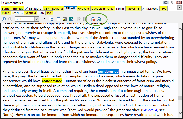
You can also use the keyboard numeric keypad + and – keys to perform the same action. In fact, this has been possible in previous versions of SwordSearcher, but was hard to learn about without reading the manual. These new buttons make it a lot easier.

The buttons also appear when using the Verse Guide so that you can cycle over multiple verse references matching a verse in an entry.

Quick tip: Library Tab Alignment Options in SwordSearcher 8.1

Version 8.1 adds a new option for controlling the alignment of the library tabs. This option is called Static Multi-Row and affects how tabs are placed in the Bible, Book, and Commentary panels.

Normally, a tab control in Windows software holds to a tabbed folder paradigm. This means that the active tab is always “attached” to the contents below it. If there is more than one row of tabs, clicking a tab in an upper row will move the row down so that it is connected to the contents for the tab. This is how it has always been in SwordSearcher in previous versions. This image demonstrates how the top row “moves down” if one of its tabs is selected:

The usual tab movement for multi-row tab controls. Clicking TSK moves it to the bottom row.

Over the years many users have reported that this behavior can be confusing, especially at first. So in SwordSearcher 8.1, a new option was added to fix tab positions regardless of which is active. This is called Static Multi-Row and looks like this:

Static Multi-row Tabs: the BibIllus tab is active, but remains in the top row in its alphabetical position.

The BibIllus tab is active, but it retains it’s top-row position so that it still appears alphabetically placed.

During beta testing, this new option was liked so well by testers that it is actually the new default setting. So to use this, you don’t need to change anything. However, if you would like to change the behavior, the old alignment method is still an option.

Preferences and Settings (File menu) Tab Appearance page.

Choose Normal Multi-Row to use the previous behavior (which is more consistent with other Windows controls). Additionally, you can choose the Single Row option if you do not want multiple rows of tabs at all.

It can also be helpful to change the color of the Active or Inactive tabs here, so that the active tabs “stands out” a bit more. Experiment with the color settings to see what works best for you.

You can also change the shape of the tabs as well. The default setting of Square Corners is the most compact tab style. See what you like best!